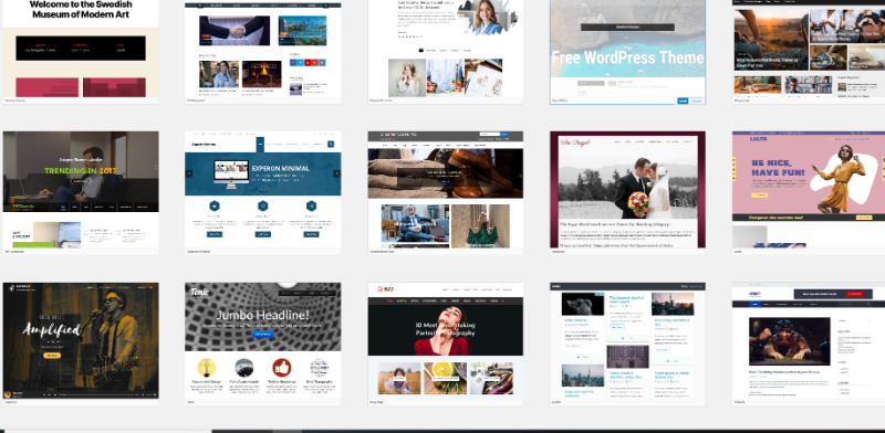
There are just three simple steps to simplify your web design. Simple seems to be the answer in today’s world. Everyone wants something that’s functional, and easy-to-use. If it requires a headache and several cans of Diet Coke to figure out, it’s just not worth the public’s time. They’d rather have something that is intuitive and simple.
 Source: Flickr
That’s why Apple has done so well with their products. They provide a simple, easy-to-use interface that can be picked up and figured out by a child. That’s why Windows 8 and Windows phones have start menus that are set up as simple boxes with words and colors. They took the simplicity thing to a whole new level and removed a lot of the traditionally 3-D or fancy graphics.
If you look around websites, web design appears to have done the same thing. In place of a busy homepage with links to every internal page there is only a few big navigation links, pictures, links that will get you anywhere in the site. If you’re attempting to compete in the web design world, you’ll have to learn how to simplify your designs a bit. Here are a few great ways to do that.
First, less is more. The more excessive clutter you can remove, the better. Don’t post two pictures when you can only do one. Don’t use 5 words when you only need 3. Condense material into simple, easy-to-use chunks that are (1) quickly digestible, and (2) obviously impactful on the minds of your reader. Your readers will only give you a few seconds to impress them, hence your first impression needs to be simple, clean, and clear. Creating condensed, impactful content will do those things for you. Less is more in web design.
Second, identify the most important aspects of your website. What are the things that people are going to be looking for most? With those few seconds, your reader needs an answer to the question, “Why should I care about this website?” Put the most common answer to that question right up front where they can see it. You can do that with large quality pictures showing the product. You can do it with large headlines on interesting content.
Third, reduce the number of pages on your website. Condense, condense, condense! The fewer pages you have, the easier it is for customers to see all of your content. Most people aren’t willing to delve too deeply into your website. In most cases, visitors will likely only hit two to five pages max. Try to make your page count as small as possible to increase the likelihood that your visitors will consume everything you have to show/share. The simplest answer seems to be the best one every time. Look at your current web design plan and look for ways that it could be improved, be made simpler.
As you master this skill, not only will you help your visitors decide whether or not they want to be there better, but you’ll also help readers stay on the site when they know that this is what they’re looking for. Avoid complicated items as much as possible. After you mastered simplicity, adding an internet affiliate marketing program to monetize your site will go more smoothly.
